The Lumia 520 is clearly low-end hardware, with its 480 x 800 screen, 512 MB Ram and only 8GB storage. The processor is nothing special,but even with these limitations it doesn’t feel low-end to hold or 2 use. The area that I bothers me most is the camera, it’s a 5 Mega Pixel, without a flash. Even with its limitations I have managed to capture quite a few pictures that I am proud of. A big plus is the inclusion of a micro SD slot that can handle up to 64GB SD cards to make up for the limited storage and the remove able battery gives me some options to get more life out of the thing.
The front of the phone has 3 Captive touch buttons, Back, Windows, and Search. One of the hardest things to get used to is the layout, the HTC Amaze has 4 captive ouch buttons starting with home, so there was an adjustment. Along the top edge is the Headphone Jack. Right side has the Volume Rockers, Power Button and a dedicated shutter button. The Left has nothing, The bottom edge of the phone has the micro USB connector for charging and connecting to the computer. The SD and Sim Card slot is under the phones back cover next to the removable battery.
When I was researching phones the lower resolution of the 520 worried me, I thought I’d miss the pixels, turns out that I don’t. The picture is vibrant and sharp, with great outdoor viewing. There are times when I do see where more pixels would be nice, but in my day to do use it’s not an issue.
Getting used to Windows Phone 8 has been a bit of a challenge,. Though there are parts of it that I think are better than any other smart phone, all to often as I use them I hit limits that leave me scratching my head and hoping Microsoft fixes in a future update. Notifications is a perfect example. When ever there is a system notification it comes down from the top of screen in a green bar. You can select it or swipe it away. Once it’s gone it’s gone. You can’t leave it for later review. It’s annoying specially after coming from Android Rich notification system, which has gotten even better in the last few releases of android. Still I like the core vision of Windows Phone, one I hope that Microsoft continues to refine in future version of the OS. Now let’s look at some of the features that makes Windows Phone such a compelling OS.
A Sea of Tiles:
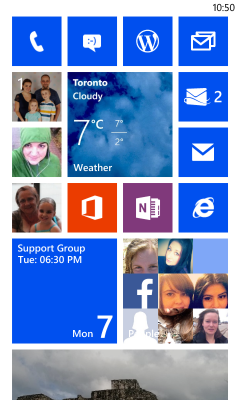
When you start with windows phone you are presented with a sea of tiles, most have the same colour. It’s a clean uniform look. If you have attached it to an Active Microsoft account the People Tile comes to life with pictures of your contacts. The photo tile shows off your own photos from attached accounts,. The Calendar has you next event, it’s almost magical. Out of the gate Windows Feels more like your own device then any others I’ve used. Unfortunately you soon realize that it’s only skin deep. At every turn the clean and useful integration seems to just fall short of what you want.
The Live Tiles can look great, the uniform sizes makes the user interface clean and crisp, but they are so inconsistent with what they show. I know this isn’t all Microsoft fault, they created the platform the app makers have to use it and to few of them are. But their own apps are so hit and miss there is no surprise that the rest of the developers aren’t taking full advantage of it.

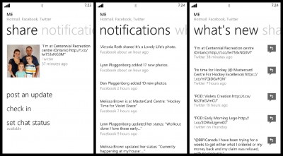
A Tile all about you, there are three panels Share, Notifications and What’s New. The first tile you see is the share panel. It has your account picture, last Status form from your social networks, 2 sharing options and your chat status. Post Update let’s you set your Facebook status and post to Twitter at the same time. Very useful, and the ability to set the sharing permissions for Facebook is great, but it’s text only I like sharing pictures and to do that I’m forced to go to the individual apps. It is also limited to Twitter and Facebook, sure these are the big 2 network but I use others and to use them I’m taken out of the integrated me tab into the individual apps. Notifications and What’s New are both feeds from your social networks, Notifications are pushed, what’s new seems to be just you standard timeline. It does provide a single interface to get the latest updates from the people you follow from multiple sources but there are so many things I can’t do there that I don’t find myself using it often.

Store:
The Windows phone store feels disjointed. It took me a little while to figure out why, then it hit me, it’s really an app store with multiple interfaces and a music store. I’ve struggled with how to write about it. I’ll start with the Store Hub, that tries to bring these different pieces together. When you first enter the Windows Phone Store you are presented with pre-defined categories, for me that’s TELUS Apps (My Careers), Nokia collection, Apps, Games and Music. This is where the hybrid nature of the store gets confusing. Tellus Apps and Nokia Collection take you to a list of apps, that you can scroll through. Well the Nokia Collection does, Tellus only has one Windows Phone app and that’s for their TV service that isn’t available in Ontario. But the rest takes you into their own Store Hubs, that break down the apps by category. This wouldn’t be so but you can also slide to the left to see highlights from the Stores. First a featured App, then Apps with a few apps surfaced, continuing on you get Games also with three games highlighted. Finally you get to music. At the bottom of each list is an All option that takes you into their own Store Hubs to browse.
To add to the confusing the Store Hubs all use a black background, but the Application lists and application details use the system theme, so if you are using a light theme it’s jarring to go from a dark list of apps to a bright list or details. The Apps and Games Hub themselves do a good an OK job of breaking the apps up and trying to expose as many as possible to the user as they browse through the store.
I’ve been mostly OK with the app selection there are a few apps that I really miss, the Starbucks app to pay for coffee is probably the biggest, but then I don’t go to Starbucks that often so it’s not that big of a deal. It’s also clear to me that both Microsoft and Nokia have pushed developers to get more apps on the platform and you can see the selection expending all the time. Of course everyone has the apps they relied on, for me the clean simple interface of windows helps
Of course when the apps they do have don’t work it makes it a very frustrating experience. So far the only app that has given me problems has been Facebook, when I try to us either the built-in functionality or the standalone app it can be hit or miss. Seeing Comments on my posts either through the Me Apps notification or the Facebook App itself Sometimes just fails. It tells me there are comments but they never load. The App also has problems with data access from time to time. It makes me want to use Facebook less, which isn’t a bad thing, if only there was Google plus on Windows phone to replace it.
Camera and Photos
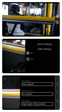
The default Windows Phone Camera application is pretty good, the dedicated shutter button will launch any time, even while the phone is locked. This helps you capture moments as they happen. Or it would if the camera loaded faster. I think that’s an issue of the 520s low-end specs and not an issue with windows phone itself. The application itself is simple, the on-screen controls are limited to a Back arrow to review pictures, the Video toggle, lens button and the three dots for settings. To take a picture you either use the Shutter button or press on the screen. It supports Pinch to Zooming and the setting allows you to select Secene, ISO, Exposure, White Balance and Aspect Ratio for photos and White Balance, Continuous Focus and Quality for Video.
There is a lot more I could write about the camera and the innovative lens that Microsoft have implemented in Windows phone, or how the Photo’s hub tries to bring your photos together from all the different places on your phone and online, It’s not perfect and I hope with Windows Phone 8.1 it gets a lot better but that will have to wait for future post.
I will finish with this final thought, with all the power and capabilities in modern Smart Phones the basic interface hasn’t change from the first PDA’s, the basic grid of Icons is still there sure it’s grown a lot since then but at the basic interface is still the same. Windows Phone has tried to change that, in a world dominated by grids of icons it has tried to be different. It doesn’t always work out for the best, but at least they are trying to change how we interact with our digital devices. The one thing that’s clear to me is that when it’s time to shop for my next smartphone Windows Phone will be high one my list of possible choices.

Comments